
React
Interactive components for React 19, with individual imports when you want them. Bring the controls; keep your application logic.
pnpm add @enoughtools/ui-react react react-domImport its stylesimport '@enoughtools/ui-react/styles.css';Your next interface deserves a point of view. Start with square edges, sharp typography, and components that mean business.
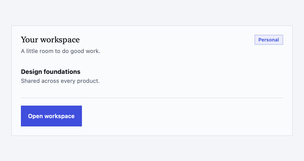
A neo-brutalist component library for React, Astro and SwiftUI. The design language behind Enough, ready for whatever you’re making.
Square edges.
Sharp ideas.
Good design. No permission slip.
MIT licensed. Use it. Change it. Ship it.REAL COMPONENTS. REAL STARTING POINTS.
Forms, charts, navigation, dialogs, tables. The controls your product needs, with a visual language you don’t have to invent from scratch.

PICK YOUR PLATFORM
Use EnoughUI in one project, or carry the same design foundations across the web and Apple apps.
Interactive components for React 19, with individual imports when you want them. Bring the controls; keep your application logic.
pnpm add @enoughtools/ui-react react react-domImport its stylesimport '@enoughtools/ui-react/styles.css';Native presentational components render without hydration. Add React islands where the interaction needs them.
pnpm add @enoughtools/ui-astroImport its stylesimport '@enoughtools/ui-astro/styles.css';Native Mac, iPhone and iPad components with shared tokens. Apple’s controls keep their familiar platform behavior.
github.com/enoughtools/enough-ui.gitChoose the libraryEnoughUI · version 0.5.0 or laterReact and Astro share web styles and variants. SwiftUI shares the palette and design foundations, with a native component API. See the renderer contract ↗
IT BELONGS ON THE MAC, TOO.
The same indigo. The same clear hierarchy. A SwiftUI library that works with the platform, from a workspace on your Mac to a form on your phone.
macOS 13+ · iOS / iPadOS 16+
No third-party Swift runtime dependencies.

THE DETAILS ARE THE DESIGN
Good components have to earn their place in a working product.
The catalog has live React and Astro examples, responsive previews and source you can inspect. The Swift gallery pairs native captures with Swift examples.
Open the catalog ↗Keyboard navigation. Visible focus. Useful error states. Explore the tests behind these behaviors, and see how each renderer supports them.
Inside component verification ↗Use the defaults or change the tokens. There’s no Tailwind setup required for consumers. Your product owns the actions, destinations and data.
See the styling guide ↗OPEN SOURCE. YOUR STARTING POINT.
Take a component for a spin. Read the source. Build a screen that feels like yours.